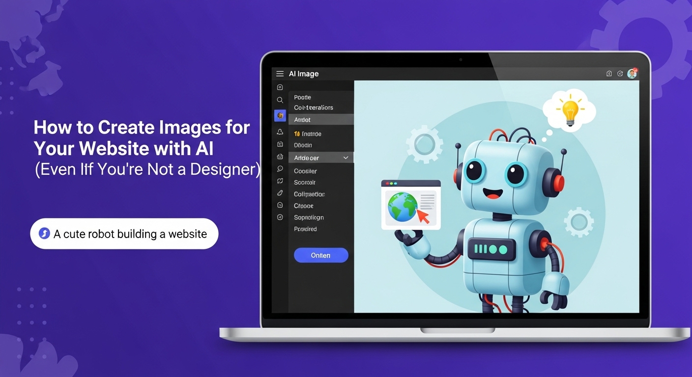
Beautiful, on-brand visuals used to require a design degree or a big budget. That reality has been rewritten by modern generative tools. A homepage hero, a blog thumbnail, a product mockup, or a background texture can now be produced from a clear prompt and a few iterative tweaks. The trick is not only to generate something pretty—it is to create images that load fast, rank well, comply with licensing rules, and convert. In this guide, a practical, workflow-first approach will be taken so that AI imagery can be produced, evaluated, and shipped confidently.
- 1) Define the job your image must do
- 2) Choose the right AI tool for the job
- 3) Prompt like a creative director
- 4) Edit for clarity, not complexity
- 5) Prepare files for the real web (performance and SEO)
- 6) License it right (and stay out of trouble)
- 7) Build a repeatable pipeline (from brief to upload)
- 8) What good looks like: patterns that work
- 9) Common pitfalls (and how to avoid them)
- 10) Governance and brand safety
- Quick reference: a compact checklist
- Traffic sources to promote your AI-enhanced visuals
It will be assumed that an editorial calendar or product roadmap already exists. Images will be planned to support those pages, not the other way around. Consistency will be prioritized: style, color, and composition will be made predictable so the brand experience feels intentional.
1) Define the job your image must do
AI should not be asked to “make it look cool.” A specific purpose should be written down for each asset:
- Conversion blockers should be reduced (e.g., a complex hero replaced with a clean, legible scene that supports the H1).
- Comprehension should be improved (e.g., a service diagram or simple storyboard that clarifies steps).
- Emotion should be evoked deliberately (e.g., warm lifestyle shots for a cozy brand; crisp studio lighting for a technical product).
A one-sentence brief is enough: “Create a 1600×900 hero with a single focal object, soft depth of field, and ample negative space on the left for headline text.” This will anchor prompts and layout choices so that randomness is avoided.
2) Choose the right AI tool for the job
Different generators excel at different tasks. Photorealistic portraits, product-style packshots, vector icons, and painterly backgrounds are separate specialties. General-purpose models (text-to-image and image-to-image) can be used for ideation, while brand content can be refined with editing tools: background removal, generative fill/extend, relighting, and upscaling. If a no-friction experience is preferred, an integrated, template-driven studio like service Jadve.com can be tried to keep generation, editing, and export in one flow.
Before committing, three test prompts should be run that represent common needs (hero, blog cover, product detail). Outputs should be reviewed for realism at 100% zoom, text rendering fidelity (if labels are required), and how well the model follows composition instructions such as “rule of thirds,” “centered subject,” or “top light, 45°.”
3) Prompt like a creative director
Strong prompts read like micro-briefs. The subject, camera, lighting, composition, materials, mood, and post-processing cues should be specified. Constraints should be given: “single subject,” “studio background,” “no text,” “no watermark.” Negative prompts should be employed to reduce artifacts. Where brand consistency is important, a style system should be saved: a palette, lens choices (e.g., 50 mm prime), lighting recipes (e.g., softbox key + rim light), and a recurring background texture. That set can be reused so a family of assets looks related.
When a real product is involved, image-to-image should be used with a reference photo. Control over pose and framing will be improved, and small flaws can be edited rather than regenerated from scratch.
4) Edit for clarity, not complexity
AI outputs should be treated like raw materials. Clarity will convert; clutter won’t.
- Subject isolation should be used for packshots and key visuals. The background can be made a soft gradient or subtle pattern so headlines remain readable.
- Generative extend can be used to create breathing room for text overlays.
- Composites are powerful, but restraint is advised: two or three elements plus a background are usually enough.
- Retouching can be light: stray reflections, jagged edges, and lens distortions can be removed.
- Upscaling should be applied only as needed; if an image will be responsive, generating at the largest required size first will avoid repeated resampling.
A single brand overlay (logo mark or subtle watermark) can unify assets without shouting. Consistent margins and safe areas should be kept so text never lands on busy pixels.
5) Prepare files for the real web (performance and SEO)
A site can be sunk by heavy images. Performance, accessibility, and search are protected when the following rules are followed:
- Formats: AVIF or WebP should be preferred for most photographic assets; PNG should be reserved for true transparency; SVG should be used for icons and simple illustrations. A fallback to JPEG or PNG should be provided for older browsers if analytics show a meaningful share.
- Responsive sources: srcset and sizes should be used so small screens don’t download desktop-sized assets. A max display width should be matched, and 2× versions should be served for high-density screens only when needed.
- Lazy-loading: the loading=”lazy” attribute should be set for below-the-fold imagery. Priority hints should be used sparingly for above-the-fold hero images.
- Alt text and captions: Alt text should explain what the image conveys (not how it looks), and decorative images should be given empty alt attributes. Captions should be written when the image adds context a skim-reader might miss.
- File names and structured data: descriptive, hyphenated file names should be used; where relevant, ImageObject metadata or article/product schemas should be attached so search engines understand the context.
- Core Web Vitals: the Largest Contentful Paint (LCP) driver should be identified (often the hero image) and its size reduced. Proper width/height attributes should be set to prevent layout shifts.
A simple rule of thumb can be set: No single image should exceed the number of kilobytes equal to its display width in pixels divided by two (e.g., a 1200 px wide image should target ~600 KB or less, ideally far less with AVIF). Exceptions can be documented for hero art and case-study photography.
6) License it right (and stay out of trouble)
Generative images feel “free,” but usage terms still exist. Commercial use allowances, model licenses, training data, and content policies must be checked. A safe posture looks like this:
- Outputs used commercially should come from providers that permit such use under current terms, and any “beta-only” restrictions should be watched.
- Sensitive content (logos, celebrities, branded products) should be avoided unless the provider explicitly offers indemnification or stock-style licensing.
- Derivative concerns should be addressed by adding human authorship: composition choices, retouching, and layout are documented. While copyright law differs by jurisdiction, human creative contribution is increasingly expected.
- Provenance should be considered: Content Credentials (C2PA) may be kept where it benefits trust; removal for deception should be avoided. If AI assistance is material to the image, disclosure in your editorial policy can reduce user confusion.
A short, internal licensing checklist should be kept with each asset: tool + model version, date generated, prompt snippet, who approved it, and where it is used.
7) Build a repeatable pipeline (from brief to upload)
The most reliable teams work from a shared template:
- Brief is written: page URL, goal, primary message, focal subject, constraints, target dimensions.
- Generation is completed: 4–8 candidates are produced; 2 are shortlisted.
- Edit is performed: background standardized, crop aligned to grid, color graded to brand palette.
- Export is handled: AVIF/WebP primary, JPEG/PNG fallback; 1× and 2× sizes; naming convention applied.
- QA is done: alt text drafted, color contrast checked where text overlays exist, file sizes verified.
- Publish occurs: responsive markup added, lazy-load configured, structured data attached if relevant.
- Measure is run: LCP and click-through are checked; if engagement underperforms, variations are tested.
A small “image log” spreadsheet can be kept so that assets are traceable and re-usable across blog posts, landing pages, email, and social.
8) What good looks like: patterns that work
- Hero images are rendered with a single subject, calm background, and strong light separation so headlines pop. Motion or complex textures are avoided above the fold.
- Blog covers are treated like magazine mini-posters: one visual metaphor, limited text (or none), and a series template to keep the archive cohesive.
- Product imagery is produced in sets: 45° primary angle, front, detail, in-context lifestyle. A margin grid is used so cards align perfectly in category views.
- Explainers favor diagrammatic clarity: consistent arrow styles, limited color palette, and legible labels that survive mobile compression.
- Backgrounds are generated as subtle patterns (paper grain, soft gradients, noise) to reduce banding and add depth without distraction.
9) Common pitfalls (and how to avoid them)
- Over-processing leads to uncanny textures and plastic skin. A lighter hand should be used on clarity/sharpen sliders, and grain can be added to smooth areas for realism.
- Text rendering in AI images remains brittle. If typography must be pixel-perfect, blank areas should be generated and text should be set natively in HTML/CSS/SVG.
- Inconsistent lighting across a set destroys cohesion. A shared lighting “recipe” should be documented and reused.
- Massive files creep in during a rush. Export presets should be locked, and a CI/CD image optimization step (or a CDN with automatic format negotiation) should be used.
- Copyright ambiguity appears when brand-identifiable items are shown. Generic alternatives should be chosen unless permission exists or the tool provides coverage.
10) Governance and brand safety
As AI production scales, a lightweight governance model should be adopted:
- A style guide (colors, moods, compositions) should be kept.
- A review gate should be established for the homepage and high-traffic pages.
- Checklists should be used for licensing and alt text.
- A/B tests should be run on key pages so image choice becomes a measurable decision, not a vibe.
When a new team member arrives, a single Notion page or Google Doc with the above is enough to get them producing on day one.
Quick reference: a compact checklist
- A concrete purpose for the image has been written.
- A suitable model/tool has been chosen; 3 prompts have been trialed.
- Composition is simple; backgrounds are quiet; focus is clear.
- Exports include AVIF/WebP plus a fallback; responsive sizes are defined.
- Alt text is meaningful; decorative images have empty alt.
- File names are descriptive; structured data is added where helpful.
- Licensing terms are compatible with commercial use; provenance is recorded.
- Performance is verified in the page context (LCP/CLS checked).
- Results are tracked; underperformers are replaced.
Traffic sources to promote your AI-enhanced visuals
- SEO: image-led landing pages with descriptive file names, alt text, captions, and relevant ImageObject/Article/Product schema.
- Pinterest and Instagram carousels that repurpose blog covers and product sets.
- LinkedIn/Twitter (X) threads that show “prompt → output → on-page result” stories.
- Product Hunt launch with a gallery of before/after visuals.
- Design communities (Dribbble, Behance) showcasing the style system behind your images.
- Email newsletters with visual “swipe files” for your niche.
- Partnerships with tool vendors (CDNs, CMSs) that syndicate case studies.
- Template marketplaces related to your stack (website builders, CMS themes).
- UTM-tracked contributions to relevant Reddit and forum threads.
- Guest posts on industry blogs demonstrating performance gains from modern formats.


