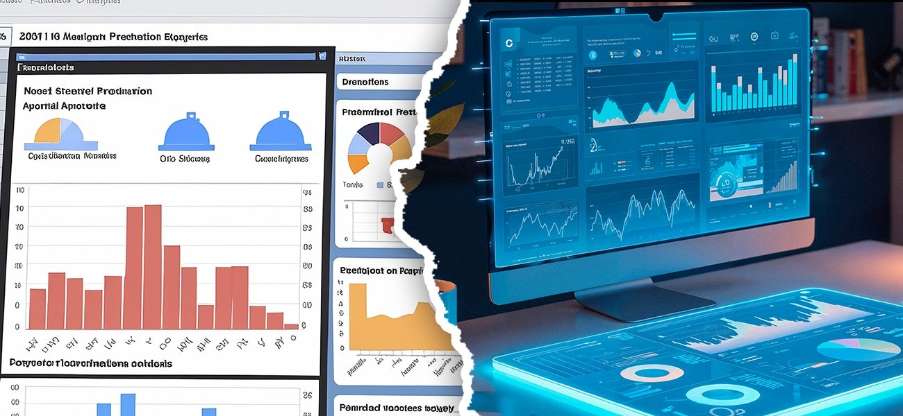
In 2026, market analysts are expected to work at a faster pace than ever before in decoding complex data into insights that shape the strategy for organizations. This is where data visualization comes into the picture. Data visualization fundamentally means using visual formats such as charts, tables, or graphs to express data in a manner that helps in understanding patterns in a better way. The conventional role of BI dashboards in this regard has been fulfilled for a long period of time now. In fact, with increasing data sizes and shorter decision cycles, a new category of tools has emerged, referred to as “AI data visualization tools.”
It has nothing to do with learning the basics of visualization anew. It has everything to do with building upon those basics. Understanding what constitutes good AI-driven visualization and how it differs from traditional visualization practices can have a profound impact on how decisions are made with AI.
What Traditional BI Dashboards Do Well
Typical Business Intelligence dashboarding is organized around pre-defined key performance indicators. The dashboard is created through queries to display key performance indicators to update their charting on a scheduled basis.
For several years, this method proved effective. It was possible to analyze performance data. It was possible to compare the data for various periods. It is most effective for reporting purposes.
However, traditional Business Intelligence also faces certain shortcomings. The scope of insights tends to remain confined to the predefined scope at the time of designing dashboards. Analyses may require recompiling reports, writing a new query, or waiting for an update in the dashboard in case of any new queries that arise unexpectedly.
How AI Data Visualization Tools Change the Game
The underlying fundamental principles and techniques in data visualization remain the same with AI visualization technology. In practice, it is a heightened sense of automation that shifts custom visualization from pure manual work. AI will generate visualizations non-statically in other words, as per pertinent questions and contextual raw data.
AI-driven visual analytics are, therefore, much less about the painstaking exploration of charts; they are focused on what really matters. It notices patterns, pinpoints anomalies or changes, just as it does explains these developments, directly pushed into the visualization structure. By turning over any passive ICT-based display, it becomes an active analytical companion.
For an analyst, it certainly implies more time dedicated to interpreting cool and important insights and less to skimming through dashboards. The AI engine ensures we see what truly carries some meaning.
Exploration vs Explanation
One of the most important differentiators is how insights are discovered. Traditional BI dashboards incorporate explorations. Analysts review visuals, filter data, and look for patterns manually. This works pretty well if the analyst knows what to search for.
AI-powered visualization emphasizes explanation. Instead of expecting users to find insights on their own, AI explains what happened and why it changed. For example, when a metric moves, AI can identify the reasons for it and show them on the screen.
This shift in decision-making using AI is itself the core story. Leaders do not merely need charts. They need clarity. AI visualization tools have bridged this gap.
Speed and Adaptability in 2026
For speed in 2026, speed is a key differentiator. Conventional dashboards refresh periodically and according to a predefined set of logic. When markets move fast, blind spots occur.
The visualization tools provided by AI adjust in real time. This happens because AI visualization tools react immediately to changing data and questions. This means that researchers can ask further questions without having to redesign their dashboards or write code.
Such flexibility enables analysts to test their assumptions, verify their hypotheses, and react to new trends in a significantly faster manner compared to the conventional BI system.
Data Literacy Without Losing Rigor
A common concern is that AI visualization can bring simplification into analysis. Such a danger exists only with a badly designed tool. Some good tools will retain a level of integrity with analysis through increased transparency and traces.
The use of visualizations is accompanied by clear descriptions of these visualizations, the sources of the data remain visible, and there is auditable logic. The analysts still control the analysis, but can now leverage automation.
Thus, this balance ensures wider availability of the insights gained without affecting the standards of analysis.
AskEnola and the Shift Towards Insight-Driven Visualization
AskEnola has an intuitive approach when it comes to data visualization. Unlike typical data visualization tools that concentrate on the creation of dashboards that remain static in their presentation, AskEnola uses insight-driven visualization that reveals what’s happening and why. The analysts are provided with data visualization along with natural language descriptions.
It decreases reliance on human dashboard browsing and enables swift and assertive decision-making with AI. By incorporating AI with analytical thinking, AskEnola assists analysts in transitioning from observation to recommendation with increased efficiency.
Comparison Between AI Visualization and Traditional BI
The decision is often not simple. The traditional business intelligence dashboard remains an essential tool in standardized reportage and governance. Nevertheless, in exploration analysis, trend identification, and decision-making in strategy formulation, AI visualization has clear benefits.
Traditional dashboards are widely used with an added AI visualization on top by organizations due to their ability to serve as the foundation for such purposes and help with better insight generation.
The practice of data visualization is still useful but with a change in how this is accomplished. The traditional BI dashboard is centered around presenting key metrics. The AI data visualization solution revolves around understanding data and focusing awareness on key areas of importance. In 2026, making good decisions with AI is contingent on this.
Through the integration of intelligence with visualization, AI enables analysts to respond swiftly, think critically, and lead confidently. Solutions like AskEnola show how the process of visualization needs to transform itself from reporting to the generation of insights in an ever more complex environment of data.


