

In the bustling world of web design, every pixel counts. Among the various elements that contribute to a well-structured layout, one often overlooked feature is the 728×90 placeholder. But what exactly does this term mean? This rectangular space may seem simple at first glance, but it plays a pivotal role in both aesthetics and functionality on websites. Whether you’re an aspiring designer or just curious about digital layouts, understanding the purpose of a 728×90 placeholder can enhance your grasp of effective web design strategies. Let’s dive into its significance and explore how you can leverage this tool for better user experiences!
Definition of a 728×90 Placeholder
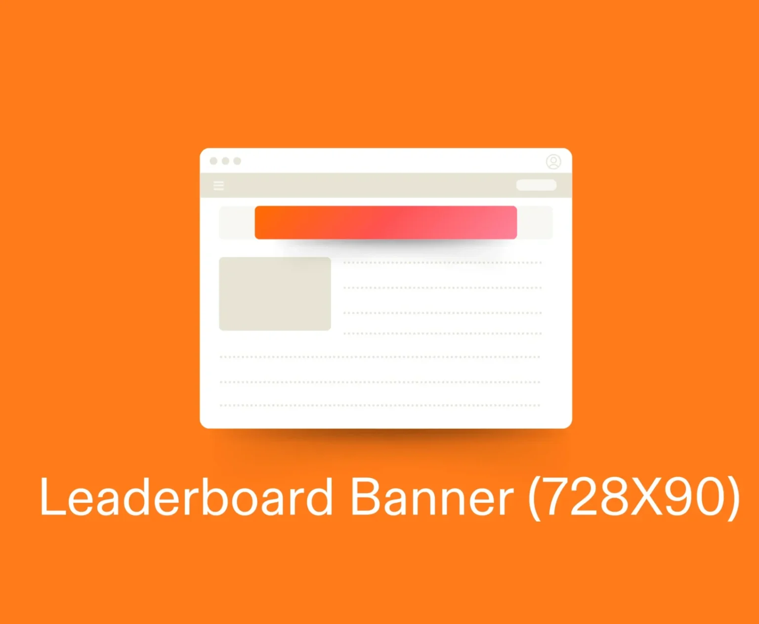
A 728×90 placeholder refers to a specific ad size commonly used in web design. This dimension measures 728 pixels wide and 90 pixels tall, making it a rectangular format that fits well at the top of webpages or within content.
Placeholders serve as empty spaces reserved for future content, typically advertisements. They allow designers to visualize how ads will fit into the overall layout without needing actual advertisements ready from the start.
The use of standard sizes like this one helps maintain consistency across designs. When developers know what dimensions they’re working with, creating responsive layouts becomes simpler and more effective.
This particular size is also favored by advertisers due to its prominence. It’s large enough to catch users’ attention while seamlessly integrating into various site formats. Understanding this definition lays the groundwork for appreciating its broader applications in web design projects.
How is it Used in Web Design?
The 728×90 placeholder is a versatile tool in web design. Typically placed at the top of pages, it grabs attention instantly. This banner size fits well within various layouts and works seamlessly across devices.
Web designers often use this space to showcase ads or important messages. It can be an effective way to promote products or services without overwhelming the user experience.
By incorporating this placeholder into designs, developers maintain visual balance while ensuring that essential information stands out. The size allows for creativity too; designers can play with colors, fonts, and images to create eye-catching visuals.


Additionally, using a consistent placeholder helps establish brand identity across different platforms. Visitors recognize familiar dimensions and layouts, reinforcing their connection with your content. Thus, integrating a 728×90 placeholder effectively enhances both usability and aesthetics on websites.
Benefits of Using a 728×90 Placeholder
A 728×90 placeholder offers a variety of benefits that enhance web design. First, it provides visual consistency across different screens and devices. This size is widely recognized, making it easier for users to identify ad spaces.
Using this specific dimension helps maintain layout integrity during the design phase. Designers can effectively plan content placement without disrupting the overall aesthetic.
Another advantage is improved loading times. By pre-designating space for ads or images, browsers can load pages more efficiently. Users enjoy smoother navigation with fewer glitches.
Additionally, a 728×90 placeholder allows for better user experience by reducing unexpected shifts in content as elements load. This leads to increased engagement and lower bounce rates on websites.
It also facilitates better collaboration among team members by clearly indicating where advertisements or critical information will appear within the page structure.
Examples of Creative Uses for a 728×90 Placeholder
A 728×90 placeholder can be a powerful canvas for creativity. Think about transforming it into an engaging banner that showcases your brand’s latest promotion. Use eye-catching graphics and bold typography to draw attention.
Another innovative approach is turning the space into a dynamic call-to-action area. Invite users to subscribe to newsletters or download exclusive content, making the placeholder both functional and appealing.
Consider using animations within this format too. Subtle movements can captivate visitors’ eyes, encouraging them to interact rather than scroll past.
Moreover, integrating social media feeds or live updates creates a sense of immediacy and relevance. It’s not just about selling; it’s about connecting with your audience in real-time.
Combine storytelling elements through sequential imagery or messages over time. This transforms the static image into an evolving narrative that keeps users coming back for more engagement.
Common Mistakes to Avoid When Using a 728×90 Placeholder
One common mistake is neglecting mobile responsiveness. A 728×90 placeholder may look great on desktop but could disrupt the layout on smaller screens. Always ensure it adapts smoothly across devices.
Another pitfall involves poor placement. Positioning in a less visible area can lead to overlooked content. Aim for locations where users naturally focus their attention, like above the fold.
Using generic images or text harms engagement too. Unique and relevant visuals resonate better with audiences than bland placeholders that lack personality.
Don’t forget about loading speed. Heavy graphics or complex scripts associated with your placeholder may slow down page performance, frustrating users before they even see your content.
The Future of 728×90 Placeholders in Web Design
As web design evolves, the role of the 728×90 placeholder will likely adapt to new trends and technologies. With the rise of responsive design, flexibility is key. Designers may look for ways to integrate this standard size into fluid layouts that accommodate various devices.
Emerging techniques like lazy loading could change how placeholders function. Instead of a static visual element, they might serve as dynamic content fillers until real images load.
Moreover, with increased focus on user experience, these placeholders might evolve into interactive components. They can include engaging animations or subtle prompts that enhance visitor interaction before actual content appears.
The growing emphasis on accessibility means designers will need to ensure that any use of a 728×90 placeholder remains inclusive. Proper labeling and descriptions will be essential in maintaining a seamless experience across all platforms.
Conclusion
The 728×90 placeholder serves a vital role in web design. It’s not just an empty space; it’s a strategic element that helps shape user experience and content layout. By understanding its definition, uses, and benefits, designers can make informed decisions about their website’s structure.
Creative applications of the 728×90 placeholder can transform it into a focal point rather than merely a background element. It allows for brand messaging or promotional advertisements to shine through while keeping the overall aesthetic cohesive. However, it’s essential to avoid common pitfalls such as overcrowding this space with too much information or neglecting responsive design principles.
As technology evolves, so does the importance of placeholders like the 728×90 format. Staying updated on trends will ensure that designs remain relevant and effective in capturing audience attention.
Utilizing a well-placed 728×90 placeholder could enhance your site’s engagement and functionality significantly—making it worth considering for any modern web design project.