

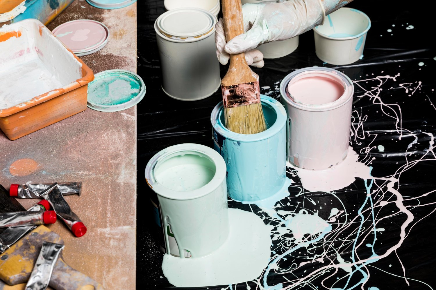
In the world of interior design, rules are often made to be broken. For decades, the standard approach to painting a room was predictable: colour on the walls, brilliant white on the ceiling, and white gloss on the skirting boards and architraves. It was a safe, standard formula designed to break up space.
- What is Colour Drenching and Why Do It?
- The Golden Rule: Assess Your Light
- North-Facing Rooms
- South-Facing Rooms
- East and West-Facing Rooms
- Room by Room: Selecting Your Shade
- The Importance of Texture and Finish
- DIY vs. The Professional Touch
- When to Hire a Painter and Decorator
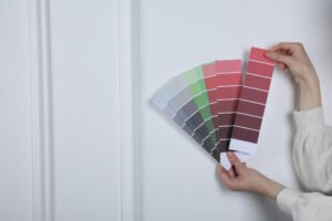
- Testing, Testing, Testing
- Summary: Be Brave!
But recently, a bold shift has taken over the design world, rewriting the rulebook entirely. It is called Colour Drenching.
If you have scrolled through Instagram or Pinterest lately, you have likely seen it. It is the practice of picking one single colour and painting everything in it. Walls, ceilings, woodwork, radiators, coving, and even doors are immersed in the same shade. The result? A seamless, enveloping, and incredibly sophisticated look that can transform even the boxiest of rooms into an architectural statement.
However, committing to covering an entire room in one shade is a daunting prospect. Without the safety net of a white ceiling to break things up, the colour you choose becomes the absolute defining feature of the space. So, how do you decide which hue is right for you?
In this guide, we will explore the art of colour drenching, how to assess your lighting, and which colours work best for specific rooms.
What is Colour Drenching and Why Do It?
Before we dive into the colour charts, it is important to understand why this technique works so well.
Traditionally, white woodwork and ceilings draw the eye to the boundaries of a room. When you look at a wall, your eye subconsciously registers the white line of the skirting board at the bottom and the cornice at the top. This effectively “maps” the size of the room, often highlighting its limitations.
Colour drenching removes these boundaries. By painting the skirting boards and ceiling the same colour as the walls, you blur the lines where surfaces meet. This creates an optical illusion that pushes the walls out and the ceiling up, often making small rooms feel significantly larger and more cohesive.


Furthermore, colour drenching is a master of disguise. If you have a radiator in an awkward spot, or pipework that creates visual clutter, painting them the same colour as the wall behind them makes them disappear. It calms the visual noise of a room, creating a backdrop that allows your furniture and art to truly pop.
The Golden Rule: Assess Your Light
The most critical factor in choosing the right colour for drenching is not the trend of the moment, but the specific lighting conditions of your room. Because the colour will be on every surface, its impact is multiplied.
North-Facing Rooms
North-facing rooms receive cool, indirect light. If you try to drench a north-facing room in a crisp white or a cool grey, the room can end up feeling flat, cold, and clinical.
- The Strategy:Embrace the lack of light rather than fighting it. North-facing rooms benefit from warm undertones.
- The Colours:deep terracottas, warm olive greens, rich teals, or moody charcoals with brown undertones. If you want a lighter look, choose a yellow-based cream rather than a blue-based white.
South-Facing Rooms
These rooms are filled with strong, warm natural light for most of the day. They are the easiest to decorate as they can handle almost anything.
- The Strategy:You can afford to go cool to balance the intensity of the sun, or go pale and airy.
- The Colours:Pale blues, soft greys, and blush pinks look stunning here. However, dark navy or forest green can also look incredible, changing dramatically as the sun moves across the sky.
East and West-Facing Rooms
East-facing rooms get morning sun (great for kitchens and bedrooms), while West-facing rooms get the evening glow (perfect for living rooms).
- The Strategy:Think about when you use the room most.
- The Colours:For an east-facing bedroom, a soft blue-green can be revitalizing in the morning. For a west-facing living room, warm neutrals will pick up the golden hour sunset beautifully.
Room by Room: Selecting Your Shade
Now that we understand the lighting, let’s look at which colours function best in specific areas of the home.
- The Living Room: Cozy and Enveloping
The living room is where you unwind. Colour drenching here should evoke a sense of a “warm hug.” You want the space to feel contained and cozy, especially in the evenings.
Top Contender: Dark Green or Teal
Bringing the outdoors in is a timeless design trick. A mid-to-dark green (think olive or forest green) creates a restful, organic atmosphere. Because green sits in the center of the colour spectrum, it is the most restful colour for the human eye. Drenching your living room in green, including the fireplace mantel and shelving, creates a library-like, heritage feel.
Top Contender: Terracotta or Rust
Earthy tones are having a massive resurgence. A rusted orange or deep plaster pink warms up a space instantly. It feels Mediterranean during the day and incredibly intimate by lamplight.
- The Bedroom: The Sanctuary
In the bedroom, the goal is sleep hygiene and relaxation. Colour drenching is particularly effective here because painting the ceiling dark prevents you from staring up at a bright white expanse when trying to drift off.
Top Contender: Inky Blue or Navy
Deep blues are proven to lower heart rates and induce calm. A navy-drenched bedroom feels like a cocoon. It blurs the edges of the room, making you feel securely tucked away from the world.
Top Contender: Sage Green or Soft Grey
If dark isn’t your thing, a mid-tone sage green offers a spa-like serenity. It is fresh enough for the morning but has enough depth to feel cozy at night.
- The Hallway: The First Impression
Hallways are often narrow, lacking natural light, and filled with doors. They are the perfect candidates for colour drenching because painting the many door frames, skirting boards, and doors themselves the same colour as the walls reduces visual clutter significantly.
Top Contender: Warm Neutrals (Greige or Mushroom)
Rather than a stark white which shows every scuff mark, a “mushroom” or “greige” (grey-beige) adds sophistication and warmth. It creates a seamless transition into the other rooms of the house.
Top Contender: The “Jewel Box” Effect
Alternatively, because hallways are transient spaces (you don’t sit in them for hours), you can afford to be bold. A bright yellow or a rich burgundy can turn a boring corridor into a stunning journey.
- The Bathroom and WC: The Surprise Element
Small spaces like downstairs toilets or bathrooms are ideal for experimenting with colour drenching. The common misconception is that you should paint small rooms white to make them look big. In reality, a white box room just looks like a small box.
Top Contender: Pitch Black or Charcoal
Painting a small WC entirely black or charcoal—ceiling and all—makes the boundaries of the room disappear into the shadows. It creates an infinite feel. Pair this with brass hardware and good lighting, and you have a high-end, boutique hotel look.
The Importance of Texture and Finish
When you colour drench, you remove the contrast of colour, so you must introduce the contrast of sheen.
If you use the exact same tin of paint for the walls and the woodwork, the finish might look flat. To get the professional look, you need to use the same colour code but in different finishes.
- Walls and Ceiling:usually a flat Matt or durable Scrubbable Matt.
- Woodwork (Skirtings/Doors):Eggshell, Satin, or Gloss.
By using an Eggshell finish on the woodwork in the same colour as the Matt walls, you create a subtle textural difference. The light will hit the skirting board differently than the wall, adding depth and interest without breaking the colour immersion.
DIY vs. The Professional Touch
Colour drenching sounds simple in theory—just paint everything one colour, right? However, in practice, it is one of the more unforgiving techniques if not executed perfectly.
Because you are painting surfaces that are usually left white (like complex cornicing, radiators, and window frames), your preparation needs to be flawless. Painting a radiator requires specific primers to ensure the paint doesn’t peel when the heat turns on. Painting laminate wardrobes or uPVC window frames to match the walls requires specialist bonding agents.
Furthermore, when the ceiling is the same colour as the walls, your “cutting in” (the line where the brush meets the corner) must be razor-sharp, or the illusion is ruined by messy textures in the corners.
When to Hire a Painter and Decorator
If you are dealing with a room that has intricate period features, high ceilings, or varying surface materials, this is where the expertise of a professional painter and decorator becomes invaluable.
A professional knows that “colour drenching” isn’t just dipping a brush in one pot. They understand the chemistry of paints—knowing which mix to use on your wooden sash windows so they don’t stick shut, and which to use on your lime plaster walls so they can breathe, all while maintaining an identical colour match.
If you are based in the capital, finding a reputable painter in London is particularly important. London properties range from Victorian terraces with layers of old lead paint to ultra-modern new builds with dry-lined walls. A skilled local painter will know how to prep these specific substrates to ensure that your bold colour choice looks smooth and lasts for years.
London homes also often suffer from “visual noise”—pipes, cables, and odd architectural bulkheads added over decades of renovations. A professional painter in London will have the experience to advise on exactly which elements should be drenched to hide these flaws effectively.
Testing, Testing, Testing
Before you commit to buying 10 liters of “Sulking Room Pink” or “Hague Blue,” you must test the colour. However, do not just paint a patch on the wall.
When colour drenching, the colour reflects off itself. The light hits the green wall, bounces off the green floor, hits the green ceiling, and reflects back. This intensifies the colour, making it appear much stronger and often darker than it looks on the colour card.
The Box Test:
To see how a colour will truly look when drenched, get a cardboard box. Remove the lid and one side so you have a three-sided “room” with a floor and ceiling. Paint the inside of the box entirely in your sample pot. Place this box in your room and observe it at different times of day. This mimics the reflection effect of colour drenching much better than a flat patch on a wall.
Summary: Be Brave!
Colour drenching is more than just a passing trend; it is a design philosophy that champions confidence. It moves away from the safety of white borders and embraces the mood-altering power of colour.
Whether you choose a calming sage for your bedroom, a dramatic navy for your living room, or a warm mushroom for your hallway, the key is commitment. Don’t do it by halves.
If you are ready to transform your home but are worried about the technicalities of painting radiators, ceilings, and woodwork to a high standard, consider calling in a pro. A qualified painter and decorator can take the stress out of the process, ensuring the finish is as striking as the colour itself.
For those in the capital looking to elevate their interiors, hiring a professional painter in London ensures that your bold new look is executed with the finesse your home deserves.
So, pick your shade, grab your tester pots (or your phone to call a pro), and get ready to drench your home in style. The result will be a space that feels curated, intentional, and uniquely yours.