
Introduction to Fonts
Fonts are more than just letters on a page; they are the visual voice of your content. Each stroke and curve conveys emotion, style, and personality. Whether you’re designing a website, crafting an invitation, or creating branding materials, the right font can make all the difference. With countless options available today, navigating the world of fonts can feel overwhelming. But don’t worry! This guide will walk you through everything you need to know about fonts—from their rich history to modern trends—equipping you with tips and tricks for making informed choices in your projects. Get ready to discover why selecting the perfect font is crucial for effective communication and design success.
History of Typography and Fonts
The story of typography and fonts stretches back to ancient civilizations. The earliest forms of writing emerged on clay tablets in Mesopotamia, where symbols formed the foundation for communication.
As cultures evolved, so did their scripts. From the elegant strokes of Roman inscriptions to the intricate designs of Gothic letters, each era contributed distinct styles. The invention of movable type by Johannes Gutenberg in the 15th century revolutionized printing. Suddenly, written works became accessible to a broader audience.
The Industrial Revolution ushered in new techniques and technologies that allowed for even more diverse font creation. Designers like William Morris sought to marry art with function during this period.
Today’s digital age has birthed an explosion of fonts ranging from minimalist sans-serifs to ornate display types. Each style reflects not just aesthetic choices but also cultural influences that continue to shape how we communicate visually through text.
Different Types of Fonts
Fonts come in various styles, each serving a unique purpose. Serif fonts, with their classic strokes and embellishments, evoke tradition and reliability. Think of Times New Roman or Georgia—they’re often used in print media for their readability.
On the other hand, sans-serif fonts present a modern aesthetic. Clean lines characterize these types, making them ideal for digital screens. Fonts like Arial and Helvetica are popular choices that enhance clarity.
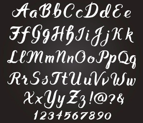
Script fonts mimic handwriting and can add elegance to designs. They’re perfect for invitations or branding but should be used sparingly due to legibility concerns.


Display fonts grab attention with bold shapes and unique designs; they shine in headlines or posters where impact is key. Decorative fonts bring personality to projects but require careful consideration to ensure they fit the overall message without overwhelming it. Each font type brings its own flair—knowing when to use which can elevate your design significantly.
How to Choose the Right Font for Your Project
Choosing the right font for your project can significantly impact its effectiveness. Start by understanding the message you want to convey. Different fonts evoke different feelings.
Consider your audience. A playful font might suit a children’s brand, while a sleek sans-serif could be ideal for corporate communications.
Think about readability as well. Your chosen font should be easy on the eyes, especially for digital content where users tend to skim.
Experiment with various styles but keep it simple. Limit yourself to two or three fonts in one project to maintain cohesion and harmony.
Ensure that your font aligns with your branding elements. Consistency is key across all platforms for building strong recognition and trust among viewers.
Tips for Pairing Fonts
Pairing fonts can transform your design from ordinary to extraordinary. Start by choosing a primary font that captures the essence of your project. This will be the star of the show.
Next, look for a complementary secondary font. It should contrast in style but harmonize with the primary choice. A serif paired with a sans-serif often works well, creating visual balance.
Consider hierarchy. Use different sizes and weights to guide the reader’s eye through your content effectively. Bold headings paired with lighter body text create an inviting flow.
Don’t forget about mood and tone. For playful themes, try whimsical scripts alongside clean typefaces. For more formal projects, opt for classic combinations like modern serifs with straightforward sans-serifs.
Limit yourself to two or three fonts per project to avoid cluttering your design. Simplicity is key when it comes to effective font pairing.
Common Mistakes to Avoid When Using Fonts
Choosing the wrong font can detract from your message. Avoid ornate fonts for body text; they can be hard to read and distract your audience.
Mixing too many fonts is another common pitfall. Stick to two or three complementary styles to maintain a cohesive look across your project. Overloading your design with various types can create visual chaos.
Ignoring font size is also crucial. Make sure that headings stand out and are easily readable, while body text should be comfortable for prolonged reading sessions.
Don’t forget about alignment! Misaligned text can confuse readers and disrupt flow. Consistent alignment helps guide viewers through your content smoothly.
Always consider accessibility. Some fonts may not translate well on all devices or for users with visual impairments—opt for legible options that cater to everyone’s needs.
Top Websites for Free and Paid Font Downloads
Finding the perfect font can elevate any design project. Luckily, there are numerous websites where you can find both free and paid fonts.
Google Fonts is a go-to resource for many designers. It offers an extensive collection of open-source fonts that are easy to use and versatile.
For those seeking unique styles, Creative Market stands out. This platform features a plethora of high-quality fonts from independent creators, making it great for finding something special.
Font Squirrel deserves a mention too. It curates a selection of commercial-use free fonts, ensuring you won’t run into licensing issues.
If you’re willing to invest in premium options, MyFonts is worth exploring. They boast one of the largest font collections available online with regular discounts on popular typefaces.
DaFont remains popular among casual users looking for fun or decorative alternatives across various themes.
The Future of Fonts: Emerging Trends
The future of fonts is vibrant and ever-evolving. Designers are increasingly embracing variable fonts, allowing for more fluidity in typography. This innovation enables a single font file to adapt to various weights and styles, streamlining web performance.
Another exciting trend is the rise of hand-drawn and custom typefaces. These unique designs add a personal touch, making brands feel authentic and relatable. As consumers seek genuine connections, this trend will likely continue gaining momentum.
Variable typography is also becoming prevalent in responsive design. Fonts that can shift seamlessly between devices enhance user experience while maintaining brand identity.
Accessibility remains at the forefront of font development. Designers are now prioritizing legibility for all users, ensuring that everyone can engage with content effectively. The merging of aesthetics with functionality paves the way for an inclusive typographic landscape.
Conclusion
Fonts play a crucial role in visual communication. They influence how your message is perceived and the emotions it evokes. With a rich history, diverse styles, and innovative trends, understanding fonts can elevate your design projects.
The right font not only enhances readability but also reflects your brand’s identity. By choosing wisely and pairing fonts effectively, you can create stunning visuals that resonate with your audience.
Staying updated on emerging trends will keep your designs fresh and relevant. Whether you’re sourcing from free or paid platforms, there’s an abundance of options available to help you achieve the perfect look.
Embrace the power of typography in your work. Experiment, learn from mistakes, and let creativity guide you as you explore the captivating world of fonts.


![swimsuit edition [abbb] – 1.20 21 swimsuit edition – chapter](https://reelsmedia.co.uk/wp-content/uploads/2025/05/unnamed-13-330x220.jpg)